Source:http://thearmoredpatrol.com/2016/03/22/wows-qa-22th-march-2016-2/
来源↗
Thanks to Carnotzet.
感谢Carnotzet。
Info about incoming interface improvements.
关于接下来会实装的界面改动的消息。
In brief
概要
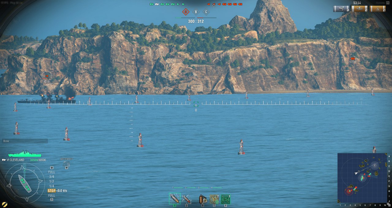
New sights with 20 “sections” (ticks) will be added in 0.5.4.1 (not in 0.5.4).
0.5.4.1会加入一个带有20“格子”的准星(0.5.4没有)

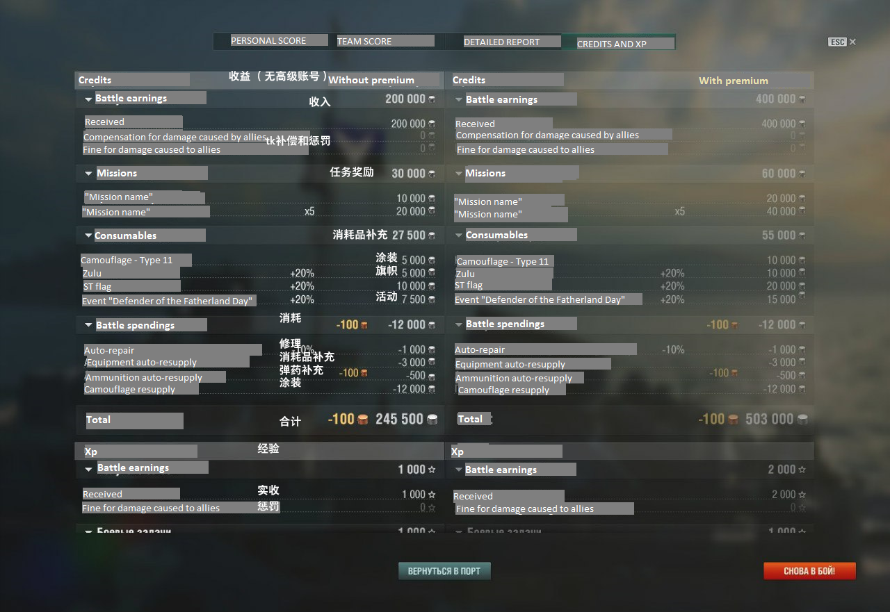
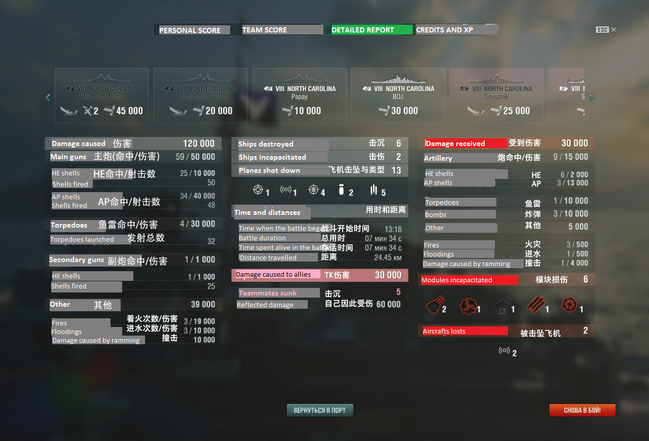
Soon, we will release a new post-battle screen. Moreover, before we release our customization system, we will add several different sights to choose from. With the new customization system, this feature will of course be further improved.
我们近期会发布一个新的战后数据界面。而且在我们实装自定义系统之前我们会先实装好几个不同的可供选择的准星。等自定义系统上线以后,这些功能会被进一步的强化。
Our current version of post-battle statistics looks like this. [I translated all of the Russian text in paint so don’t blame me if it’s not very beautiful and professional]
我们目前开发的战后数据看起来是这个样子的[用画图翻译了一些图片,所以看起来也不是特别漂亮,轻喷]
特此感谢119同学帮忙P图+翻译


We will naturally fix all the bugs and anomalies.
我们会修复所有的Bug和不对劲的地方的,
On the whole, the thought process behind the interface development is to model it on what the users want. Naturally, there are those who “want submarines” or “want to play another game”, but the majority of players see the same problems as we do, with some rare exceptions (as you probably know, the changes we’re talking about were not planned in the past few days; by the way, this is a good opportunity for us to think about changing our way of informing players about what we do). Things don’t go always as smoothly and quickly as we and the players would like, but the interface is fully part of the development of the game. The team in charge of interface development doesn’t and can’t have any priorities, except conceptual ones.
从思维层面上来说,界面开发背后的概念就是把界面弄成用户想要的样子。当然了现在也有“想玩潜艇”以及“想玩别的游戏”的玩家,但是大部分玩家注意到的问题和我们注意到的差不多,当然也有例外(我们这些正在准备推出的改动也不是前两天才开始弄的;顺便我觉得这是个能让我们思考要怎么样以其他方式来通知玩家这些改动的很好的机会)。但是凡是都有例外,开发进程也不像我们和玩家所期待的一样顺风顺水。但是界面是这个游戏的完整的一部分。负责界面开发的团队除了那些概念上的东西以外并没有,也不会有任何的开发优先级。
In details
细节
Your post [the one the dev is answering to] was a useful read. I will try to give a detailed response and I’ll start with your assessment of our work. It’s rather strange to hear that we “do nothing” and that we’ve done only 4 improvements in 15 months.
你的帖子[就是这段文章回复的原帖]我们读了很受用。我会试图给出一个详细的解释,首先来谈谈你对于我们工作量的评估。我每次听到我们“啥事都不干”而且在过去的15个月中只改动了4样东西都感觉怪怪的。
Time flies by players often forget,take for granted, or don’t notice certain things, it has been and always be so.
对于玩家来说时间过得太快了。所以他们就理所当然的认为/或者是注意不到一些事情。一直以来都是这样。
For instance, “elements needed to be added with the release of new game modes” is considered by many as taken for granted, as if we don’t need to spend time working on it. It is not true. The support for new game modes (Ranked, Team battles) can hardly be categorized as what we call “support”; in fact, the interface team fully developed these game modes hand in hand with the other teams. Here is the list of things we added since the beginning of the beta test (in no particular order):
举个栗子,“随着新的游戏模式上线时一并需要出现的界面元素”会被玩家认定是一定会出现的,他们认为我们不需要花时间去搞这些。对于新的游戏模式的支持(天梯,组队战)在我们眼里可不能被分类成“支持”;界面团队是和其他团队一起携手开发了这些游戏模式的。下面这个列表中列出了我们自从Beta测试以来往游戏里加入的东西(不分先后):
- Chat and contact list
聊天以及好友列表 - Events, missions, challenges and their reward system (incidentally, the mission “banner” was significantly improved in the last update)
活动,任务,挑战以及奖励系统(顺便说句,任务的那一“横条”在上个补丁中有这重大的改进) - Port selection
母港背景选择 - Ship carousel filters (we will soon release an improved version)
母港的船只过滤器(我们很快会上线一个改进版) - Second version of the captain feature, including a captain carousel (as well as: the possibility to display captains from other nations, which many players whined about; the option to cancel the dismissal of a captain; an improved process for transferring captains; the ability to retrain captains)
第二版舰长功能,包括了舰长选择器(也就是说可以看到其他国家的舰长,这点很多玩家都抱怨过了;可以取消解散舰长的命令;改进过的舰长换船;还有可以重新训练舰长的机制) - Reports and compliments
举报和赞扬系统 - First version of the karma system
第一版的声望系统 - Two versions of system messages
两版系统消息 - Cammos
迷彩界面 - Flags
信号旗界面 - Signals
快速消息发布 - Reworked profile summary (ranked season stats were improved in the last update)
重制了玩家的数据总结界面(每一季天梯的数据在上个版本中被改进了) - Ranked battles
天梯战 - Consumables
消耗品 - Auto-resupply feature
自动购买机制 - Team battles
组队战 - Personal offers system
个人折扣系统 - “educational” messages for new players (they don’t show for experienced players)
只显示给新玩家看的“教育性质”的信息(老玩家是看不到的) - Arpeggio mod
苍蓝Mod - Armor x-ray (not released yet)
母港的装甲透视模型(还没上线) - Support for the “Zone” mode (yes it also required UI work since it differed from the old “Standard battle” mode)
对于“制海权”模式的支持(没错这也需要重制UI,因为和以前的“标准战斗”不一样) - Support for the new “Standard battle” mode
对新的“标准战斗”的支持 - Tutorial mission
教程任务
It’s also important to remember that even basic features, such as the report and compliment system, don’t make themselves (unfortunately), as some people seem to think. I must emphasize that, with this list, I’m not making any excuses for the things we didn’t do. But as we have decided to put the matter on the table, I wanted everyone to understand the amount of work we’re talking about.
同时也请记住就算是举报和赞扬这种很简单的系统也不是我们随便划拉划拉就能弄出来的。我必须要强调,我把这个列表贴出来的原因并不是给我们没能实现的内容找借口。但是我们既然决定了要把这件事拿到太阳底下来说,我就希望所有人都能够理解我们到底在讨论的是一种什么样的工作量。
Moreover, during all that time, we carried out several optimization cycles regarding the interface (freezes occur less often) and added several improvements “under the hood”, which will give us more room for development and allow us to implement new decisions faster.
况且我们在实现这些内容的同时还进行了好几轮对于界面的优化(现在不像以前卡顿那么厉害了),还偷偷摸摸的加入了一些改动,而这些改动可以给我们更大的开发空间,并且可以让我们更快的实装各种新的内容。
In addition to all of those features (of great and medium importance), every update brings many minor improvements (about 20-30 minor visual or functional features). For instance, the capitalization of ship names (which was a heated subject of discussion). Yes, it wasn’t very successful when introduced – we didn’t inform players about what it was and why it was added. It’s a natural reaction when something people were accustomed to is changed. We fixed it, we explained – the anger subsided, many players understood our decision and are now fine using it. In general, there isn’t a single solution; take for instance word capitalization, many other games use caps in their whole interface. We added a practical component to that decision (as we always try to do).
除了这些新的功能(有着中等~重要优先级)以外,每个补丁还会带来一大堆小的改进(大约有20~30个小的视觉上或者是新功能)。举个栗子来说,船只的名字现在是全部大写了。没错,这东西在我们实装当初并没能获得巨大的成功—我们没有跟玩家提前说明我们会,并且为什么要这么改。在不声不响的情况下改动一个群众已经适应了的东西的确就会有这种自然的反应。我们解释,并且搞定了这个问题——大家就没有那么生气了,许多玩家理解了我们的决定并且现在也习惯了。总的来说并没有一个通用的解决方案;就拿船名全部大写这件事情来说,许多其他游戏的界面中也是全部大写的。我们对这个决定先实装了一个比较实用的部分(我们一直都是这么干的)
Naturally, all of the work we’ve done doesn’t mean there aren’t any problems with the interface and doesn’t negate the fact it needs some improvements. I will comment on the list you’ve made:
当然了,我们做了这么多也并不代表我们的界面中没有问题,我们也不能否认界面需要继续强化这一点。我对你所列出的列表进行一下评论:
Sights
瞄准镜
We increased the crosshair width. In update 0.5.4.1, it will have 20 “sections” (ticks)
我们增加了准星的宽度。0.5.4.1中,它会有20个“格子”(密位)
Torpedo indicator
鱼雷指示器
To track your torpedoes, you can switch to the tracking camera [Z]. In earlier versions, we had binoculars for torpedo armaments but decided to remove them. To aim torpedoes, you had to switch to binoculars and take aim, which wasn’t very efficient since the ship you were aiming at was often outside of the binoculars view.
想要看鱼雷到底跑哪去了可以按Z切换追踪视角。在更早期的版本中我们是有鱼雷的瞄准镜视角的,但是我们最后决定移除掉,因为要让鱼雷瞄准就必须要切到瞄准镜下才能进行,但是这样又不够有效,因为很多时候你要瞄准的船会跑到瞄准镜外面去。
Reload indicator
装填指示器
The problem of the reload bar not filling up linearly is an error. We’ll make sure to fix it.
装填条不是线性增长的情况是我们这边出的错误。会修复的。

[As you can see, the reload on the icon is not even half done whereas it’s more than half completed on the line indicator]
[图标上的装填还没过半,但是那个一长条的指示器就已经过半了]
Cannot see incapacitated torpedo armaments in gun mode (and vice versa)
在主炮瞄准时看不到被打烂的鱼雷管(反之亦然)
Our primary goal is not simply to show information on the screen but to bring it to the player. Someone posted a screenshot of a World of Warcraft player’s interface (with a bunch of add-ons) that illustrates well what would happen if we implemented every suggestion players made. In such a case, it would become impossible for new players to apprehend the game. The idea of “it will solve itself” is important since it led us to the concept of allowing the playerbase to customize their interface.
我们的主要目标并不是简单的把信息丢在屏幕上,而是要把信息展示给玩家。有人发了一张CCQ玩家的截图(装了一堆插件),这张图表明如果我们要实装玩家的每一个意见的话界面会变成什么样。在这种情况下,新玩家想要理解游戏是很难的。但是“玩家自给自足”的概念是很重要的,所以我们才有了可以让玩家自定义界面的这个想法。
Full interface customization is a very important aspect for us but, unfortunately, it will not be implemented in the near future. The technology we use is not appropriate to implement the customization we would deem suitable yet. For now, customizing one’s interface as one would like is only possible through mods.
对我们来说,可以自定义整个界面的所有部分是很重要的方向,但是近期是搞不出来的。我们现在手上的技术并不能做到我们想做的事。现在的话想要自定义界面只能靠mod。
Ship “model”
船只的“模型”
In a near future, you’ll be able to see your AA/secondary guns composition in battle
近期的话你就可以在战斗中看到你的AA/副炮组了
Minimap
小地图
At about the same time, we will significantly improve the minimap. In addition to being able to display various radii, you’ll be able to enable or disable several parameters directly in battle. I think that everyone will find his groove.
(和船只模型一起)我们会对小地图进行重大改进。除了在小地图上显示你的各种半径以外,还可以在战斗中直接启用或者是关闭一些功能。每个人都会找到他自己最喜欢的那种配置的。
Messages regarding ship kills
关于击杀提示
[Player suggests adding something like : Vasya_Pupkin [Kongo] destroyed Alex_nagibator_666 [NewMexico]]
[玩家的建议是:张三[金刚] 击杀了 李四[新墨西哥]]
We plan to modify it, it’s on our list.
有计划要改,这个在我们的开发列表上。
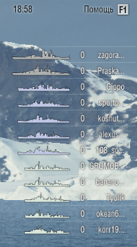
“Players panel”
“玩家侧边栏”(译注:请参考WOT)

I will be frank, we won’t add players panel soon. As you know, there are other problems regarding the interface which are more important than players panel. For those who want more information than what the current battle interface offers, I suggest you download legal mods.
我只说了,没计划要加入这种东西。你要知道现在我们手上要处理比这侧边栏更加重要的界面的问题。对于那些想要在战斗中看到战斗界面上提供更多消息的玩家,我建议你们去下载正规的Mod。
Mods
Generally speaking, we treat mods not only as an opportunity to experiment various features (as you probably know, there are several mods made by WG employees), but also to understand what the playerbase wants, what we should do first (and what we should not do); it’s also a good opportunity for players to put their ideas in practice.
这么说吧,我们觉得Mod不仅是一个很好的实验各种想法的机会(你也知道了,WG的雇员制作了好几个Mod),还是一个可以理解玩家到底想要什么东西,而且我们要先弄什么(还能看出来不该弄什么)的机会;而且对于玩家来说也是个把想法付诸于实践的好机会。
Post battle interface
战后界面
The post-battle screen doesn’t suit anybody, us included. We’ve already said we’re working on improving it. The new version is nearing release and will be implemented in one of the next updates.
现在这个战后界面实在是太烂了,我们自己都觉得不行。我们也说过了会进行强化。新版本很快就要上线了,接下来的某个补丁中就会实装。
I must add that all the values shown in the post-battle screen don’t come from nowhere. All the values the player sees come from various data collected server and client side. If something doesn’t appear on the stats screen, it often means that data simply isn’t collected. Thus, the game interface is only the tip of the iceberg, a little part of a more complex system which all of the dev team are working on.
我必须要说明的是,战后数据中的数据并不是凭空捏造的。玩家所看到的所有数据都是从客户端和服务器端中收集来的。如果玩家找不到某个特定数据的话,那基本上就说明这数据单纯的没有被我们收集而已。所以说游戏的界面其实只是开发团队在搞的复杂系统的冰山一角而已。
Arrows in drop-down menus
下拉菜单的箭头
I agree that this feature is not obvious, but it works simply enough that players can understand how it works after the first time. Once a player learns how the arrows work and what they mean, he doesn’t have further problems with them. Will we change it? We will, but in order to do that, we need to change all of the port interface first.
我同意,这个功能并不是特别引人注目,但是起码玩家在第一次用过之后就知道这东西是怎么回事了。等玩家明白箭头到底是什么意思的时候,以后再看见箭头就不会有问题了。我们会改动吗?是会的,但是要改动之前要先把所有母港的界面改一遍才行。
Upgrades on ships
船只上的插件
If you want to change one upgrade for another, you can simply click on the new one and the game will ask you what you want to do with the previous upgrade. There are help bubbles everywhere in case you need help. And if you think that it’s not enough for some elements, do not hesitate to report it to us.
如果想把一个插件换成另一个的话,直接点新的就行了,之后游戏会问你之前那个插件你要怎么处理。这些是到处都有的,在你需要帮助的时候就会出现的帮助气泡。如果你觉得有些地方的帮助不够多的话,跟我们讲就行啦!
Post-battles messages (messages that appear in the port on the right after a battle)
战斗后的消息(在战斗后会出现在母港中的信息)

The current interface already works a bit differently than how it’s shown in your screenshot. The next step is to add specific messages depending on what tab the player is on in the port.
我们现在手里的这套界面已经和你截图中的这套有点不一样了。我们下一步的目标是根据玩家位于母港中的哪个分页面下再去显示特定的信息。
Pressing [Esc] in the captain skills or the ship modules/upgrades window doesn’t send the player back to the port
在舰长技能或者是船只的升级/模块界面按ESC并不会把玩家丢回到母港
We will fix this issue. Our current architecture doesn’t allow us to quickly fix this issue.
我们会修复这个问题的。但是我们现在的结构并不能让我们迅速的修复这个问题。
Closing the game by pressing [Alt + F4] or clicking on the X in the upper right corner in windowed mode
能不能按Alt+F4或者是在窗口模式下点右上角那个X就直接能关掉客户端
It works as follows: every command for closing the client will ask for a confirmation. It’s not only to prevent accidentally closing the game by clicking on the cross in windowed mode or pressing Alt+F4 but also to prevent inexperienced users to fall in the “Press Alt+F4 to…” trap.
是这样的:每一个会导致客户端关闭的命令都会进行一次确认。并不仅仅是为了防止手滑关掉客户端的情况,还有为了防止新人玩家掉进那个“按Alt+F4可以如何如何……”的坑。
Closing thoughts
结语
We appreciate any feedback the players provide us. Moreover, the interface is created solely from players’ feedback. Constructive feedback is, however, taken more seriously. But, as I have already said, it’s impossible to please everyone of you without making another person unhappy. This does not apply to one person specifically. Yes, it’s always worth it for you to give us your point of view and your ideas. But remember, that the implementation of a suggestion is not always as simple as you think it is, whether it be from a technical or game design standpoint.
我们对玩家的每一点反馈都表示感谢。而且界面这个东西其实全部是基于玩家的反馈才能做出来的。那些具有建设性的反馈意见我们会更加严肃的去考虑。但是就像我说过的一样,众口难调,不可能做到让大家都开心。对,你为我们提供你的建议和想法的确都是好事。但是请记住,无论是从游戏设计的角度还是从技术角度来说,想要实装玩家们的建议当中的功能并不是什么易事。

按alt+F4打开探照灯